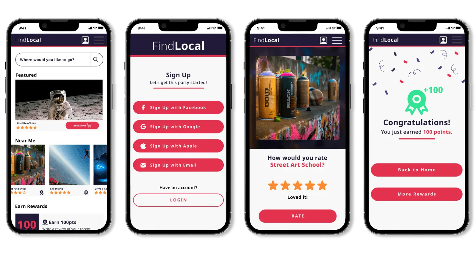
A travel app concept built around a pretty simple idea: finding authentic local experiences shouldn’t require three hours of Googling.
FindLocal is an original app concept I designed from scratch, grounded in user research and centered on connecting travelers with genuine local culture. The kind of places locals actually go, not the ones with the best SEO. Turns out a few other companies had similar ideas around the same time. No notes.
This was a self-initiated student project. The problem was real, the research was real, and honestly it was just a fun thing to design.
DISCOVER
Solving the Right Problem
Before designing anything, I needed to understand how people actually travel. Not how travel brands think they travel, but what real people do when they land somewhere new and want to find something worth doing.
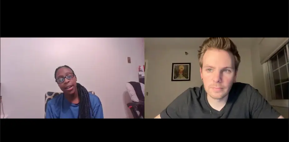
User Interviews
I conducted five user interviews to uncover travel habits, preferences, and pain points. The goal was simple: understand how people discover experiences at their destinations and what frustrates them about the process. The pattern that emerged was pretty consistent. People wanted authentic, local experiences but kept ending up at the same places everyone else went. Turns out that’s a pretty relatable problem.
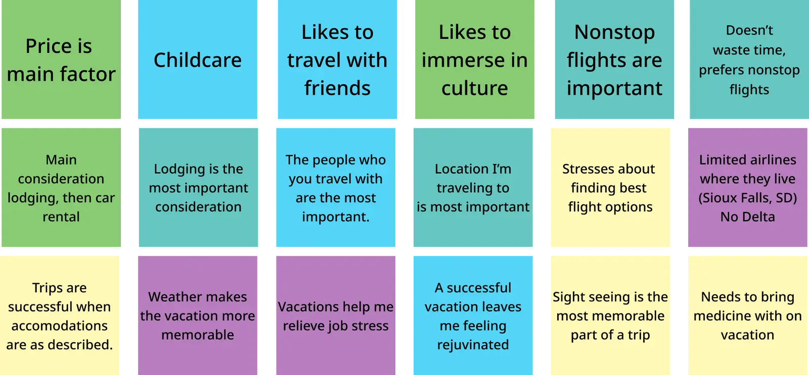
Affinity Diagram
After the interviews I built an affinity diagram to synthesize the findings. Grouping insights across five interviews helped surface the themes that would drive the design. The big one: travelers don’t lack options, they lack context. Too much noise, not enough signal.
DEFINE
Telling a Story
One of my favorite parts of UX design is giving users a voice in the process. Everything that follows was built with a specific person in mind.
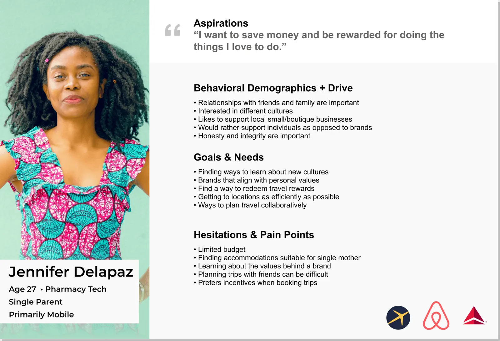
User Persona
Using insights from the interviews and affinity diagram, I developed a user persona to anchor every design decision. When a decision felt uncertain, I came back to this and asked whether it actually served the user or just looked cool. Sometimes the answer was both. Sometimes it was neither and I had to start over.
Storyboard
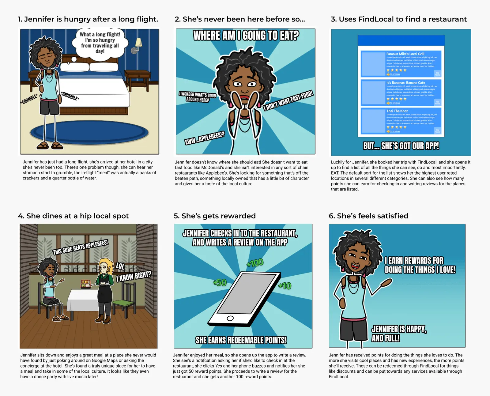
With the user defined, I built a storyboard to add real-world context to the solution. Meet Jennifer. She’s just landed at her destination and wants to find a restaurant that actually reflects the local culture, not a chain with suspiciously perfect Yelp reviews. We follow her through the app, finding somewhere worth going, and getting rewarded for leaving a review afterward.
DEVELOP
Blueprint for Something Good
With the problem defined and the user understood, it was time to figure out how to actually build this thing.
User Task Flow
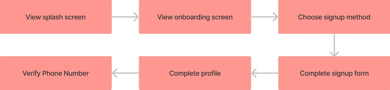
Before touching prototypes I mapped out the exact steps a user takes moving through the app. Task flows come after research for me deliberately. I’d rather understand the problem fully before I start solving it. It’s a lesson I’ve learned the hard way more than once.
Visual Design
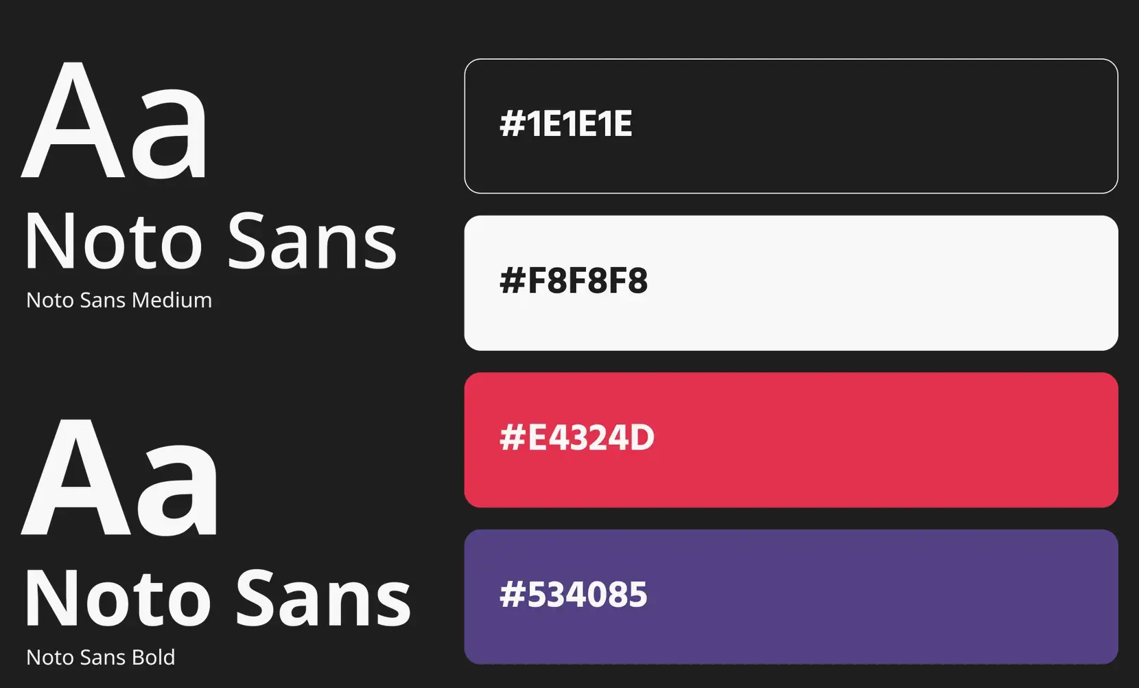
I developed the visual identity before wireframing, which isn’t always the approach but felt right here. Building the app entirely from scratch meant I could establish the typography and color system early, making every subsequent design decision faster and more consistent. Knowing how something will look makes it easier to sketch how it should work. At least that’s the theory. It worked out this time.
DELIVER
A Matter of Fidelity
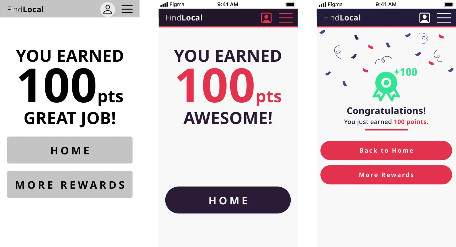
Prototyping for me always starts at the lowest possible fidelity and works up deliberately. Sketches first, then wireframes, then mid-fidelity, then high-fidelity. Each step is an opportunity to test an idea before you’ve committed too much time to it.
Fidelity Progression
The rewards screen is a good example of the progression. What starts as a rough sketch ends as a fully interactive screen with tested interactions. At each stage I incorporated feedback and refined the design. The user stayed at the center of every decision, which sounds like something everyone says, but I genuinely mean it.
Reflections
I was happy with where this landed, but I’d do the research phase differently next time. The user interviews were useful but could have been sharper. Better questions yield better insights, and the quality of your research sets a ceiling on everything that follows. Guerrilla testing earlier in the process would have caught things I only found later.
Good project. Good lessons. Would design again.