Role: Brand Strategy, Naming, Logo Design, Visual Identity, Web Design, Front-End Development, Print Design, Signage, Social Media, Marketing Strategy Timeline: 2.5 years Client: Rebel Chef, Farmington, MN
From a name on a napkin to a sign on a building — a complete brand built from the ground up.
Some projects start with a brief. This one started with a conversation and a vision. Keith Russell, a self-taught chef who’d cooked his way from home kitchens to restaurants in Los Angeles, was coming back to Minnesota to open his own place. He needed everything. A name, a brand, a website, a marketing strategy, signage on the building — and someone who could execute all of it before opening night.
That someone was me.
Over the course of 2.5 years, I built Rebel Chef from concept to fully realized brand. I helped Keith land on the name, wrote the tagline — Birthplace of the Food Revolution — designed the logo, developed the complete brand identity, built the website, designed the menus, created the physical signage, and ran the social media and marketing strategy. Then I stuck around long enough to measure whether any of it actually worked.
It did.
Role: Brand Strategy, Naming, Logo Design, Visual Identity, Web Design, Front-End Development, Print Design, Signage, Social Media, Marketing Strategy Timeline: 2.5 years Client: Rebel Chef, Farmington, MN
THE BRAND
Starting From Scratch
Keith came to me with a concept, a passion, and a property under renovation. No name, no logo, no brand direction. The best time to build a brand is before the doors open, and we had that rare opportunity to do it right.
The name Rebel Chef felt right immediately. Keith wasn’t a culinary school graduate working his way up through established kitchens. He was self-taught, fearless, and cooking food that didn’t fit neatly into any category. Asian Fusion dishes built from locally sourced ingredients, global inspiration filtered through a Minnesota lens. The name had to reflect that spirit.
The tagline followed: Birthplace of the Food Revolution. Bold, declarative, and unapologetic. The kind of thing you put on a building and mean it.
Visual Identity
The brand needed to feel as bold as the food. The logo anchors on strong typography — REBEL in heavy weight, CHEF in a contrasting style — with a raised fist icon that communicates the rebellious energy without taking itself too seriously. It works at any size, from a business card to a building facade.
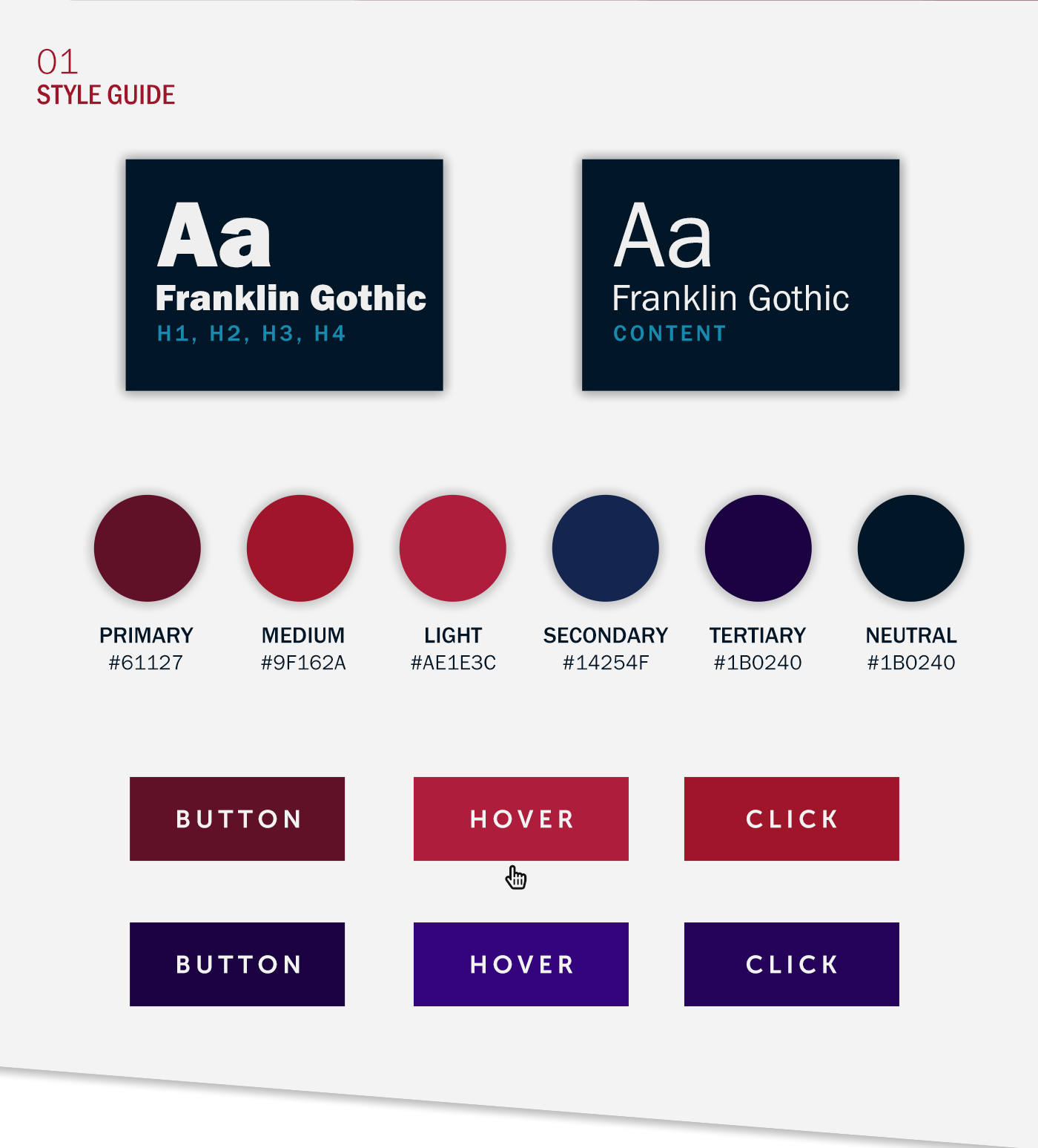
The color system was built around a deep crimson primary, supported by navy and a rich tertiary purple. Serious, confident, and warm enough to feel welcoming. Franklin Gothic carried the typography, giving the whole system a grounded, American quality that fit the “Food Revolution” positioning perfectly.
THE WEBSITE
Design and Development
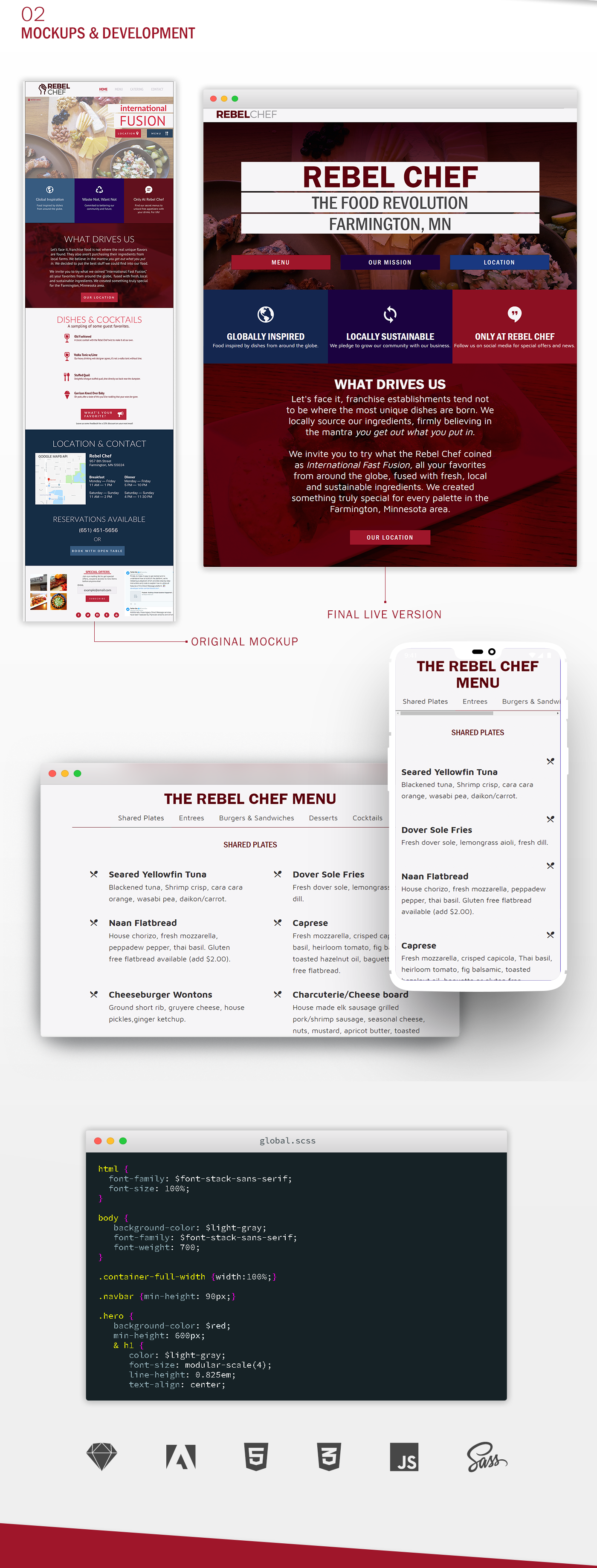
I designed and built the Rebel Chef website from scratch. The goal was to communicate the brand’s personality immediately, make it easy for customers to find the menu and location, and drive reservations. The original mockup and the final live version are close. Which is what happens when the designer and the developer are the same person.
The online menu was built as a fully interactive experience, organized by category with clean typography that made the dishes the star. I handled all front-end development in HTML, CSS, JavaScript, and Sass, then handed off to a backend team for database integration and deployment.
THE PHYSICAL BRAND
Taking It Offline
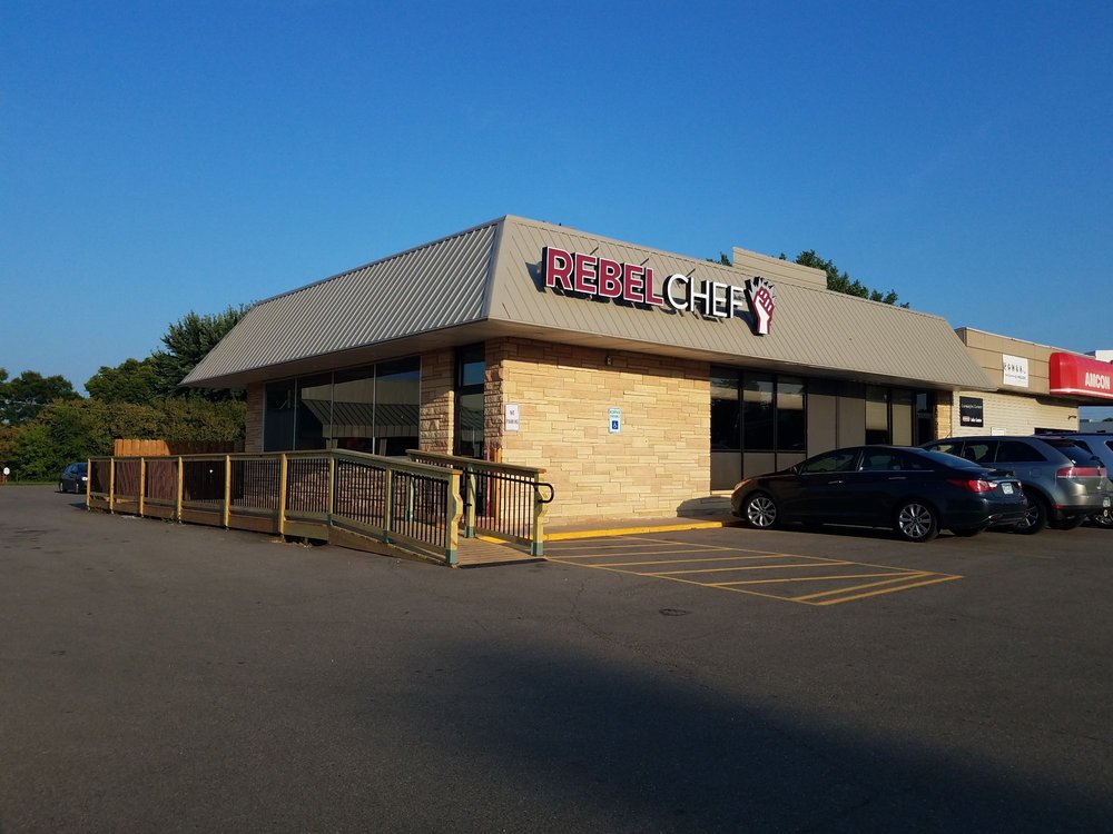
A brand lives beyond the screen. I designed the physical signage for the building exterior — the Rebel Chef logo scaled up and mounted above the entrance, visible from the road and unmistakable in person. Seeing your work on a building never gets old.
THE RESULTS
Measuring What Matters
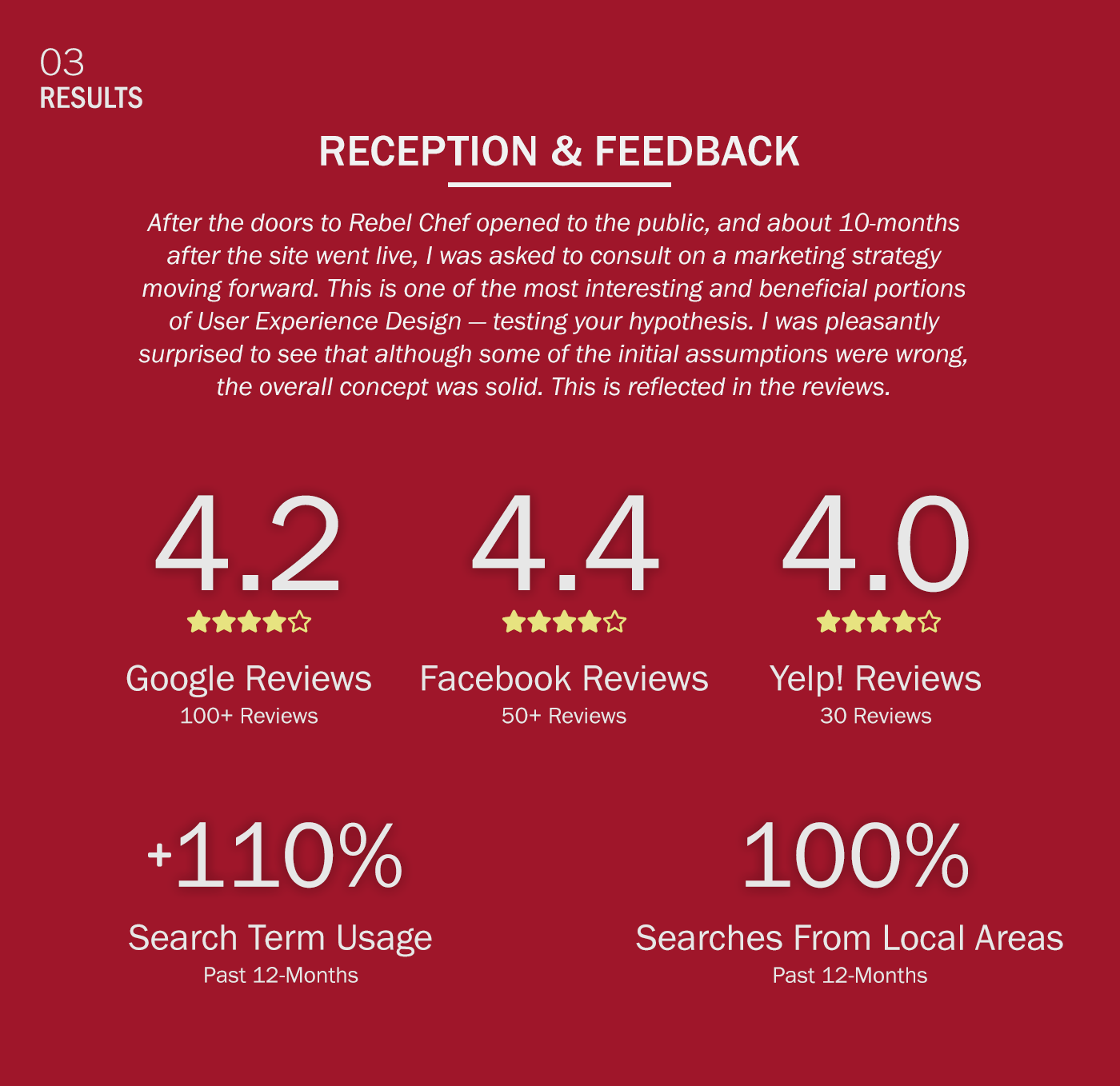
Ten months after launch, I reviewed the metrics and worked with Keith on a forward marketing strategy. Restaurant success lives and dies on reviews, and Keith had faced some early hurdles — as most first-time restaurant owners do. A 3.5 Google rating wasn’t going to cut it.
I designed a plan combining social media and in-house marketing specifically aimed at improving review scores and search visibility. The results over the following 2-3 months:
- Google Reviews: 3.5 to 4.2 (100+ reviews)
- Facebook Reviews: 3.7 to 4.4 (50+ reviews)
- Yelp: Solid 4-star rating established
- Search term usage: +110%
- Local area searches: +100%
Those aren’t vanity metrics. For a restaurant, review scores directly impact whether someone walks through the door or keeps scrolling.
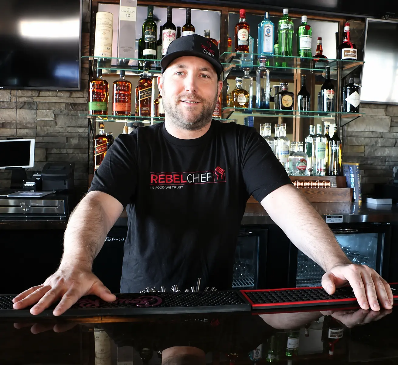
Keith
The man behind the food revolution. Self-taught, relentlessly creative, and exactly the kind of client who makes you want to do your best work.
Rebel Chef eventually closed its doors — a casualty of COVID, like too many great independent restaurants. But the brand, the food, and the community Keith built around it were real. The Food Revolution happened, even if it was shorter than it deserved to be.